I am currently in the 9th week of my Data Management and Visualization class at University of Maryland University College. For this assignment I needed to create a and record a Time Series Presentation using a dataset of my choosing. I uploaded my recording on youtube.
Here is the transcript:
Good Evening and welcome to my time series presentation. As you can see by the title I will be adding to what has been titled The Quantified Self movement. The tagline over on the website quantifiedself.com is self knowledge through numbers.
My name is Carlton Matthews and I will be you guide through some of my personal data.
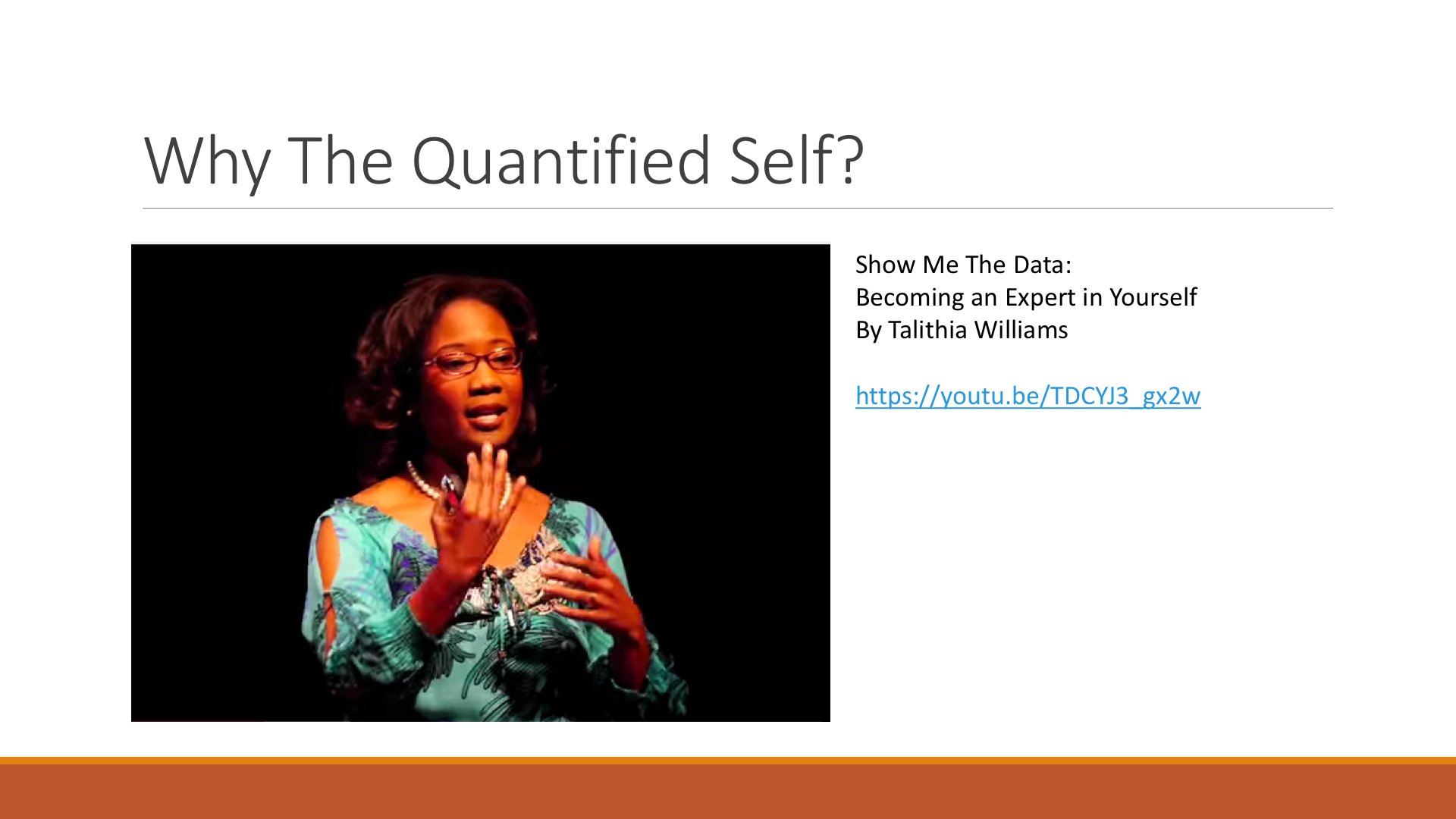
So how did I become interested in this type of data tracking. For me it started after listening to a TED talk given by Dr. Talithia Williams entitled, Show Me the Data: Becoming an Expert in Yourself in Feb 2014. She gave this talk at Claremont College in 2014 and she explained how knowing your bodies data can help you make better decisions. It was a fascinating talk that pushed me to further my own data collecting habit.
In the summer 2014 I purchased my first fitbit flex and started tracking daily activity like the number of steps I was taking as well as the number of hours I slept and the number of calories I would eat. Even though I had been tracking this data for almost 2 years I have never exported it and looked for any trends.
I decided to extract a small slice from my data and look at the 1st 2 months of 2016 and see what i can predict going through the rest of the year. From 2 January 2016 through 2 March we will look primarily at the how the number of steps I take fluctuate from day to day. We will also look at hours slept and calories eaten and see if either of them impact the steps.
We will also be looking at the high temperature for each day to see if that has any influence on my daily activity.
I expect to see that warmer temperatures lead to more steps taken. I also think that days that I am ore active I eat less calories. So as Dr. Williams says in her video Show Me The Data.
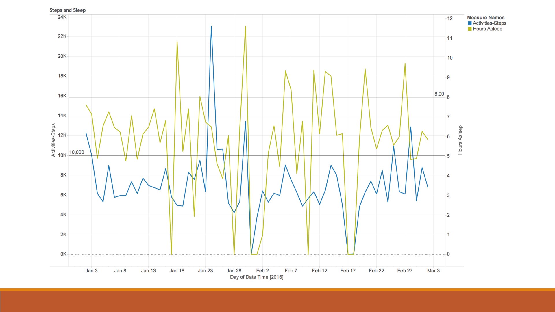
In this slide we take a look at both number of steps and hours of sleep laid out together. The Blue line shows the number of steps take while the yellowish green line shows hours sleep. There are 2 reference lines that show the 2 goals I have with this data. My step goal for each day is 10000 steps and my sleep goal is 8 hours per night as you can see I consistently do not meet either goal.
The interesting thing that I see here is that periods of higher activity seemed to indicated a period of longer sleep. I guess this is to be expected but I did not think they lines would mirror each other as much as they do.
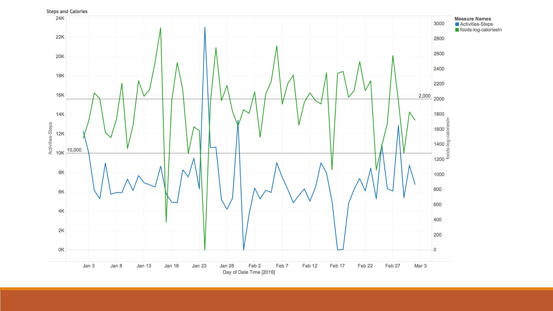
Here we see steps and calories shown similarly to the previous slide. This time however I do not see the number of calories impacting the number of steps as much. My assumption was that on days when I was more focused on what I ate I would likewise be conscious of the amount of activity I would participate in. Again we see that I have not been hitting my goals here denoted by the reference lines for my step and calorie goals.
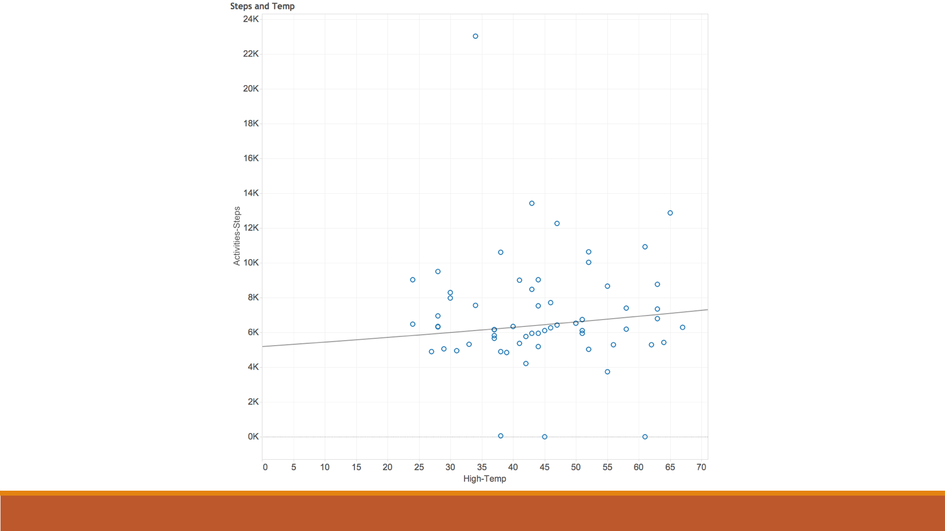
When I decided to see if the daily temperature impacted the number of steps I thought that it would be an simple task to pull in the necessary data. That was not the case. I eventually found the Quality Controlled Local Climatological Data on the National Oceanic and Atmospheric Administration page. This allowed me to extract the data from the local weather station near the BWI Airport.
With all of that introduction we see the step counts plotted against the daily temperatures for my area. As I expected we see based on the trend line that there is an increase in the step count as the warmer weather hits. I am glad to see this confirmed.
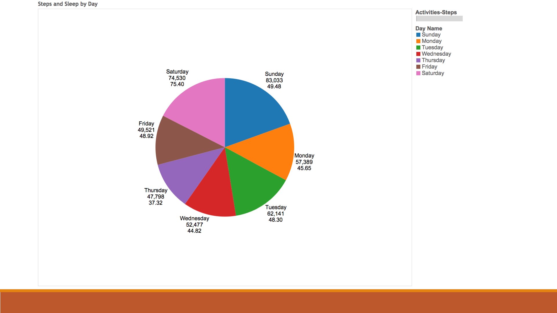
This last chart is the most interesting to me. I decided to look at which days I was the most active and got the most sleep. Here is the breakdown. I am the most active on the weekends. This makes sense since I work in an office and am at my desk for most of the day. I also get the most sleep on the weekends. Again this make sense due to family, work and school commitments. I do the least amount of moving and get the least amount of sleep on Thursdays. I did not expect that.
Not the question is what can we predict for the data that we have just seen. Looking at the data I expect to see an increase in the number of steps taken. I also expect this to result in a greater amount of sleep.
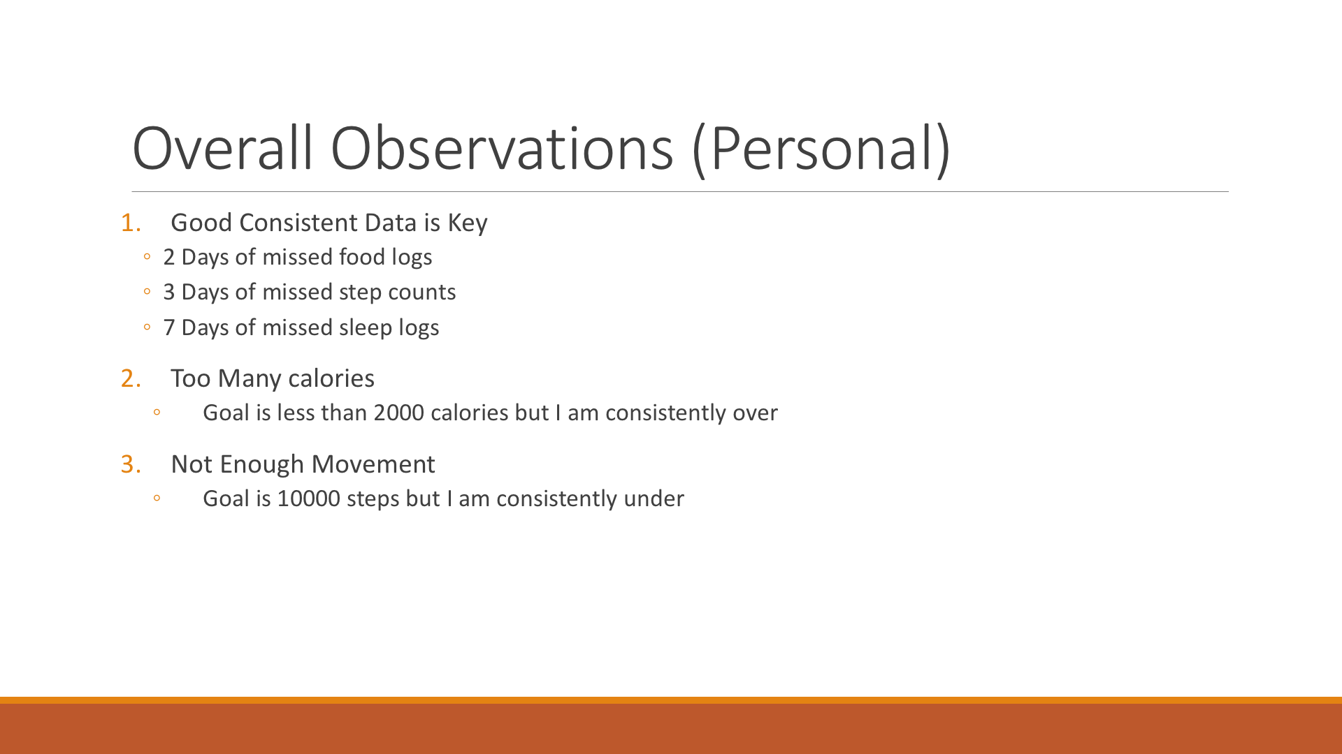
Here are some additional observations that I made from this exercise. Having good data is key. This means that the data set should have consistency. I had to exclude a larger range of data because there were gaps in my logs. Even in this dataset there were days of missed food logging, step counts and sleep records.
Sadly I also observed that I am eating too much and not moving as much as I should. Going forward I need to correct that.
 Thank you for joining me on this look at my quantified self. Start tracking your own data. Who knows what you might learn.